One of the best ways to leave a positive and lasting (visual) imprint of your brand is to have a unique brand logo. Your journey will start with our conversation. I’ll ask you questions based on the key values of your brand. These values will ultimately be conveyed through your finished logo. Once a starting point is established we’ll discuss colour and line. I’ll create several distinct pencil mockups which we’ll critique together. Once a balance is found, the logo will be digitally manipulated and further refined. We’ll review the design together at each key step before progressing. Your finished logo will be memorable, current and reflect your brand.
Jack Spowart Illustration Logo

Jack Spowart Logo
My own logo materialised from several different sources. It needed to represent the outdoors in some way. It also needed to be clean and strong in shape and line. I sketched several ideas down while in Lake Wanaka which feature in my ‘Mountain Sketches’ print. I focused on one idea in particular, the simple layering of triangles. A triangle is a structurally strong shape. My work is primarily landscapes and a simplified mountain is a triangle.
I wanted my logo to have depth. Layering. Comparable to mountains on the horizon. It needed some colour.
I had a clear base for my design. I needed to simplify it but without losing its strong visual appeal. I noticed how shadows layer on surfaces when several light sources are present. I realised my design started to look like the corners of my sketchbook.


Mount Adventure Logo Illustration

Mount Adventure
I was contacted via instagram in regards to a logo and van vinyl design for a new business. I met the client for coffee to discuss the vision. The business model was to have a fleet of vans for hire, kitted out with kayaking and biking racks.
The vans would be situated at key airports in Europe where they could be easily accessed by travelling outdoor enthusiasts.
The client is an experienced kayaker, spending much of her time on the Soca River in Slovenia. I was asked to incorporate the landscape of Slovenia into the graphic. I began researching the Soca River and its surroundings. Several pencil sketches followed before digital manipulating the image and adding text in Photoshop. After discussions with the client the design was finalised with a website header, instagram logo and vector graphic ready for sending to a van livery company. The client was very happy with the final product.


Climb Inverness Logo

Climb Inverness Logo
I decided to set myself a mock brief as a new and engaging challenge. My goal was to create a climbing related logo for a new club in Inverness.
It had to include two main elements - climbing in some shape or form and a connection to Inverness geographically.
I began with an outline of the Scottish mainland and surrounding islands. I studied the intricate coastline of Scotland’s west coast and came to the conclusion that it looked ‘climbable.’ There are obvious hand and foot holds with some overhanging sections (specifically the Kintyre peninsula) with the first crux moving through and past Campbeltown.
I needed to incorporate a climbing aspect into the drawing. It needed to connect to Inverness in some fashion. Through the use of negative space I started to think a climber could be brought inside the outline. Sport climbing involves moving up or across a wall and connecting rope through bolts and carabiners. I began to explore various ways in which a climber could climb up through Scotland with a clear focus on Inverness.
My resulting final logo includes Scotland with a focus on Inverness and an obvious graphic of a climber. The climber is hanging on to where Inverness is situated geographically. This logo could be altered and easily translatable to a range of locations across Scotland.
I decided to donate this logo The Ledge, a new climbing centre in the process of being planned and built on the waterfront of Inverness. It will not be their official logo but will be used in merchandising.

Barre en Pointe Logo
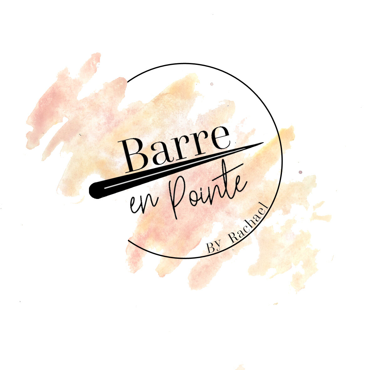
Barre en Pointe
I was approached by a friend to a design logo for her newly formed, Barre teaching business. The design needed to reflect the elegant but strong nature of Barre, a physical exercise incorporating movements derived from ballet.
Barre en Point
I began by researching Barre as I wasn’t familiar with the practice, compiling imagery and key value. My client gave me a general idea of style, colour and text but the visual was ultimately up to me. I began with the creation of a colour palette which was reviewed with the client. I used watercolour paints to create the background visual. I sketched over this with pencil to experiment with imagery. I settled on a bold line, representing the Barre bar with perspective to draw the viewer in. After reviewing with the client I finalised the watercolour visual and scanned it in for digital manipulation. We agreed on a text pairing, one elegant to match the movement of barre and the other strong and legible. The circular design was important as my clients primary point of contact with potential customers was facebook and instagram.